the image to the right is the edit, i used photo shop just to play around with the colours and tone making the image more deep and contrasting it with the plain block font that has been researched in a previous blog post
the image to the left is the original. we decided due to the season and environment that an autumn theme would work well.
the image of florence is postiond really well i like the idea of her being hidden in the leaves. while doing our photoshoot we looked for location that had this background. this autuminal season emphasises on death and re growth, which represent conntoations that we want to give to dan (male actor) showing his loss for ezgi ( girlfriend)

the image to the right is also an original. i like this image alot and think that it would look good as one of the 5 images in our digi pack.
i have chosen not to add text to this image as i think it would ruin the peacfull effect that it has, i have played around with the exposure of the image and made it more brighter and enhanced the colours
forgetting mary is the name of the video although we would not use one picture dedicated to the song name i wanted to experiment with what picture we could use for illustrating the list of songs on the album.

the image to the right has been edited using an online image edit website called Picnik, i used a variety different edits including a shadown around the edge of the picture making the image look more narrow.

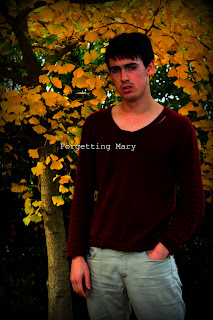
below is an image of the snger
'ED SHEERAN'this idea of connecting with nature is now more commonly seen in main stream music adverts and in videos. we have tried to challenge this concept by applying it to our singer who is alternative rock 'indie' making the music advertsing as a whole more appealing to the public eye, but still keeping it within the genre, we have done this by keeping dan in none branded clothing and making sure his appearance is not artifical (scruffy hair and natural poses)VVVV
i took in consideration the feed back and made teh artist name bigger and changing the name to broken dreams which gives it a more softer approach and goes better with the album image.
ALBUM COVER????
.
ALBUM COVER????
I edited this image and add the text to see what potential it had to be our album cover. i love the image, and have used the same font as other images.
i asked peer for feedback on what they thought and this is what they said...
Leah Beavis -the name of the artist needs to be bigger then the album name in order to show that it is not a band but a solo artist
-the name 'broken glass' seems to harsh on top of the leafy autmn background, maybe a softer name like 'broken dreams' would not only show that the album is emotional but also that its about pain.
INSPIRATION FOR THE AUTUMINAL SHOOT
Florence and the machine use the autuminal effect location quite alot. me and emma really like this idea and used it as a consistent theme through out of advert and digipak photo shoots. the colour are very warm and add a sense of mystery as well pronoting the anxiety that we want to develop for our character in the video. in some sence the autuminal effect make florence look slightly lost, this ambiguity is what we want dan to look like showing his emotion towards ezgi.


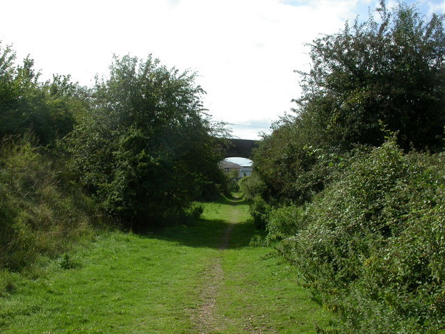 railway line bridge
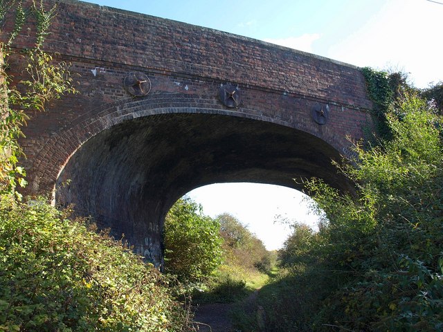 new industrial area
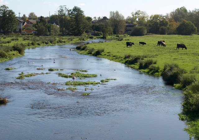 bickerly mill stream
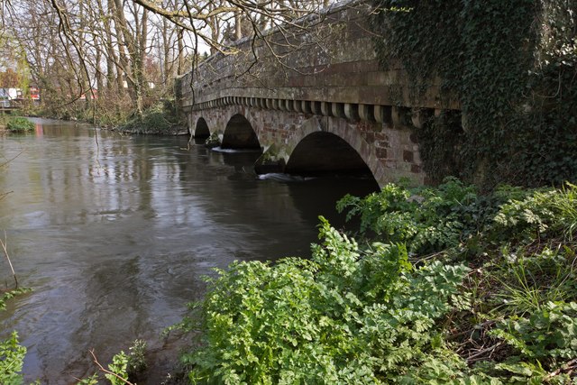 Shady side of the bridge, River Avon,

 this is just a rough idea of what you would normally exect to find on the back of a digi pack


 i love this cover for the rolling stones, the dirty orange/yellow look is really effective.
 in contrast the cooler colours also are very effective and the use of a human figure matched with block text is very bold.
 joni mitchells album shows alot of emotion the close up the face has inspired us to take photos of ezgi in a close up setting in order to see pain, confusion ect. this adds alot of emotion to the album and tells us that there is a narrative in the songs.
 cigarettes are quite key in our filming we used the light and smoke of the cigarette as a feature in our filming this joni mitchell album shows us emotion, she seems fed up, but with the cigarette and smoke in the picture it adds a really nice calming effect.


